
The Psychology of Color: Choosing a Palette That Matches Your Menu and Brand
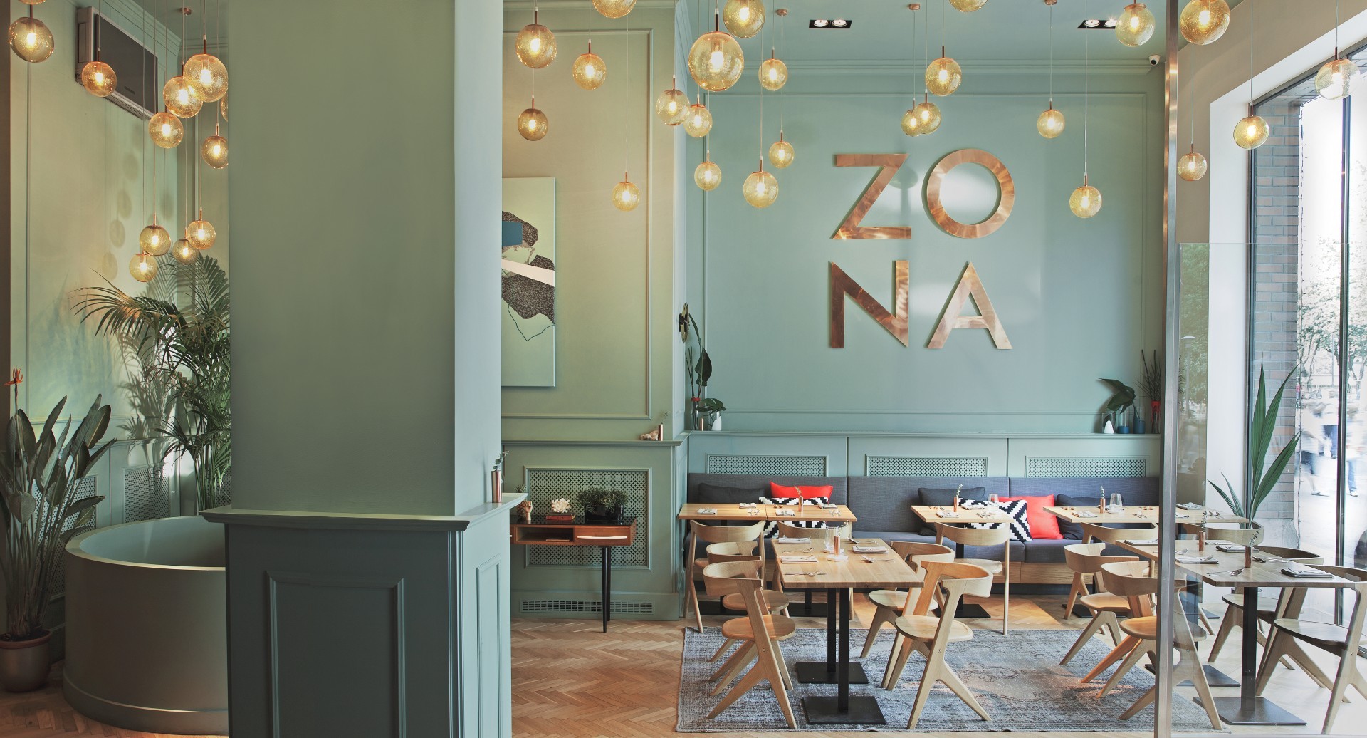
When it comes to designing your restaurant, color isn’t just decoration—it’s persuasion. The hues you choose set the tone for your space, affect guest behavior, and even influence how your food is perceived. Whether you’re plating upscale cuisine or slinging tacos and tequila, your color palette should match your menu, your vibe, and your brand identity.
Let’s dive into the psychology of color and how you can use it to create an experience your diners will taste, feel, and remember.
Why Color Matters in Restaurants
Color impacts people on a subconscious level. It can make a space feel cozy or clinical, spark hunger or suppress it, and even affect how fast people eat. Choosing the right palette isn’t just about style—it’s about strategy.
Color influences:
- Appetite and mood: Certain colors stimulate hunger; others calm or energize
- Perception of space: Light colors expand; dark colors create intimacy
- Time spent dining: Fast food chains use bright tones to speed up meals; fine dining opts for muted hues to encourage lingering
Think of color as part of your service—it speaks before the food even hits the table.
How to Match Color to Your Menu Style
Just like food, color has flavor. The palette you choose should reflect the style and spirit of your cuisine.
Common food and color pairings:
- Spicy or bold menus (Mexican, Indian, BBQ): Reds, oranges, and earthy tones add heat and vibrancy
- Fresh and healthy menus (salads, juice bars, plant-based): Greens, whites, and soft neutrals evoke freshness and calm
- Upscale/fine dining: Deep blues, dark grays, and jewel tones add elegance and sophistication
- Comfort food and cafés: Warm browns, buttery yellows, and soft blues feel cozy and familiar
Let your food lead the way—your color choices should complement what’s on the plate.
Understand What Colors Say to Guests
Each color sends a message, and it’s important to make sure yours aligns with your brand story. Here’s a breakdown of what common colors communicate:
| Color | Effect | Best For |
|---|---|---|
| Red | Stimulates appetite and energy | Fast-casual, high-turnover concepts |
| Orange | Encourages conversation and hunger | Family-friendly or lively spots |
| Yellow | Grabs attention and feels cheerful | Breakfast spots, cafés, food trucks |
| Green | Evokes freshness and health | Plant-based or health-forward restaurants |
| Blue | Calming, but suppresses appetite | Upscale or minimal design (use with balance) |
| Black/Gray | Sophisticated and dramatic | Fine dining, modern or industrial spaces |
Don’t Forget Branding & Consistency
Your color scheme shouldn’t stop at the walls. It should flow into your logo, uniforms, menus, social media, and even plating. Consistency strengthens your brand and creates a seamless experience from the front door to the final bite.
Design elements to align with your palette:
- Menu design and typography
- Website and digital content
- Packaging and to-go containers
- Signage and outdoor branding
The more consistent your colors, the more memorable your brand becomes.
Tips for Choosing and Applying Color
Ready to choose your palette? Keep these quick tips in mind:
- Start with three colors: a dominant, secondary, and accent tone
- Use neutrals to balance bolder shades
- Test swatches under natural and artificial light
- Get feedback from staff and guests before going all-in
- Work with a designer or branding expert for polish and consistency
And remember: repainting is cheaper than a rebrand—if your palette doesn’t fit, don’t be afraid to make a change.
Wrapping Things Up
Color isn’t just about what looks good—it’s about what feels right. When your color palette aligns with your menu, your brand, and your customer vibe, it elevates the entire dining experience. Whether you’re going bold and spicy or calm and clean, make sure your walls speak the same language as your food.
Because in the restaurant world, first impressions aren’t just visual—they’re emotional. And the right color can leave a lasting taste.